
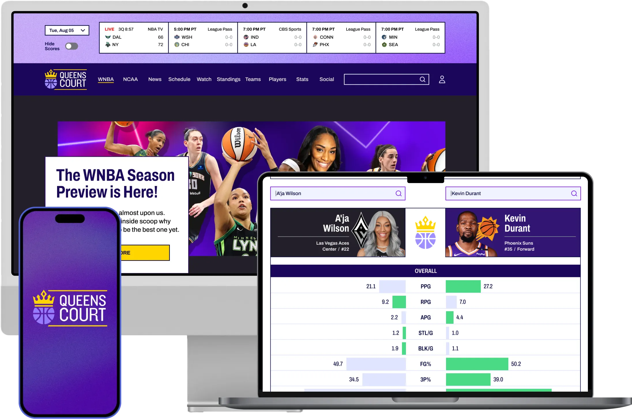
A responsive product concept designed to give women’s basketball fans one place to discover coverage, explore players and go deeper into the statistics and stories they care about.
Role
Product Designer
Project Type
Independent concept project
Platform
Responsive web concept
Responsibilities
Product strategy, UX research, competitive research, information architecture, interaction design, UX/UI design, branding, prototyping, usability testing
Tools
Figma, FigJam, Maze, Notion, Google Meet, Adobe Creative Suite
Duration
8 weeks
I led the project end to end, from identifying the opportunity through user research to defining the product strategy, information architecture, and final responsive prototype.
Executive Summary
Not another sports news site. The opportunity was to give women’s basketball fans the depth and control they weren’t getting from general sports platforms.
As a fan myself, I often had to search a player’s name plus “latest news” just to find current coverage. Major sports platforms offered scores, headlines and ways to follow teams or players, but the experience often stopped at surface-level information.
I interviewed 5 women’s basketball fans to understand whether that frustration extended beyond my own experience.
It did, but the research also changed my original assumption about the solution.
I initially thought deeper coverage meant richer editorial storytelling about athletes. Instead, I found that fans defined depth differently. Some wanted statistics and player comparisons. Others wanted more control over the players, teams and social content they followed.
That reframed Queens Court around three needs:
Discovery
Make women’s basketball easier to find without digging through broader sports coverage.
Depth
Give fans more ways to understand players, performance and stories beyond headlines.
Control
Create a future product direction where fans could shape the experience around what they care about.
I explored a broad feature set, but deliberately kept much of the personalization vision conceptual rather than trying to design an entire ecosystem within the project timeline.
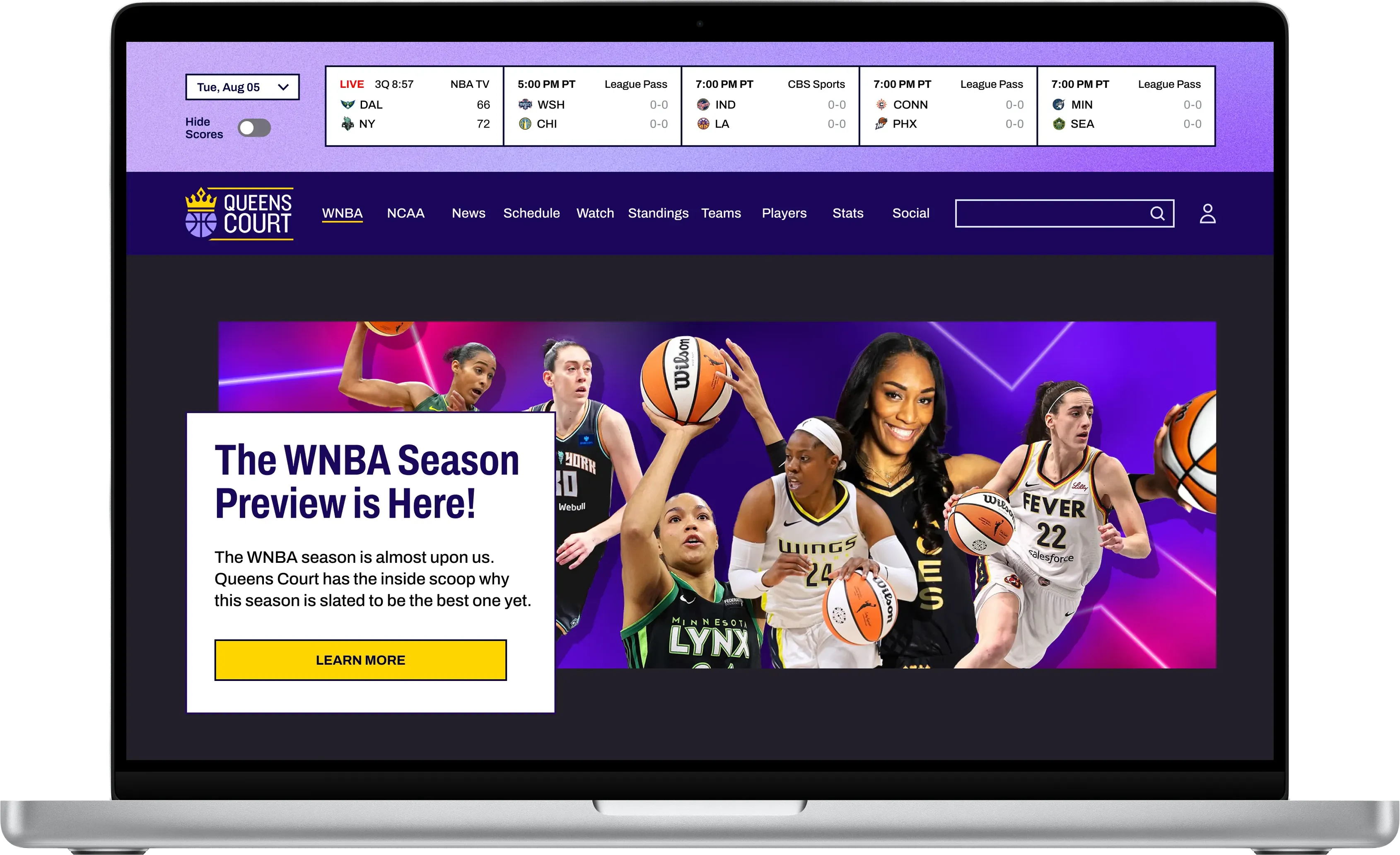
I took a focused set of experiences through prototyping and usability testing, including Home, Player Profile, Player Statistics and Player Comparison.
Low-fidelity testing with 5 participants exposed opportunities to improve content hierarchy and statistical presentation.
After iterating, 5/5 participants successfully completed all four core tasks in high-fidelity testing with no reported navigation confusion.
Because Queens Court is a concept project, these results represent usability validation with a small participant sample, not production adoption, retention or business impact.
5
low-fi participants
5
fan interviews
4
tested tasks
5 of 5
participants completed all tested tasks
The Problem
Growing fandom still requires fans to hunt for their favorite coverage.
As a women’s basketball fan, I often found myself Googling a player’s name plus “latest news” just to understand what was happening.
Major sports platforms made it possible to follow teams and players, but the coverage often stopped at scores, headlines and surface-level updates. The experience felt out of step with the growing interest around the sport. I wanted to understand whether that frustration was mine alone or part of a broader fan experience.
Fan interest was growing faster than the experience around it.
Women’s basketball had experienced significant growth across professional and college sports, including increases in viewership, attendance and social engagement.
Yet women’s sports still represented a small share of mainstream sports coverage.
That created an important tension:
Interest was increasing, but fans were still navigating products and media ecosystems where women’s basketball was rarely the primary experience.
US Sports Media Gap
Women’s sports only receive a fraction of mainstream media coverage. In the U.S., it accounts for just 8% of total sports media coverage, leaving fans to rely on fragmented platforms and manual searches to follow teams, players and stories they care about.
There’s a disconnect between growing interest and limited visibility. This presents a clear opportunity.
Men
Women
Pro Sports
92%
8%
NCAA Division 1
47%
53%
Research
I wanted to understand what fans were actually missing, not assume that more content was the answer.
I interviewed 5 women’s basketball fans about how they discover, follow and engage with teams and players.
I explored:
•
Where they currently found women’s basketball content
•
What information they actively searched for
•
How they followed individual athletes and teams
•
What frustrated them about existing sports platforms
•
What would make a dedicated experience useful enough to return to
A consistent problem emerged.
Fans were piecing together their experience across general sports platforms, search and social media.
One participant described setting alerts for women’s sports content across multiple apps, only to find that the algorithms still rarely surfaced what they wanted. But the interviews also showed me that “better coverage” meant different things to different fans.
Three needs kept surfacing across the research.
Discovery
Women’s basketball content was fragmented across broader sports platforms, search and social media. Fans could find information, but they often had to actively look for it.
Depth
Finding a headline wasn’t the same as being able to explore the sport. Fans wanted richer player information, statistics, performance context and stories that went beyond basic updates.
Control
Fans did not all want the same kind of depth. Some were interested in player statistics and comparisons. Others wanted to follow specific teams and players, bring social content into the experience and have more control over what appeared on their dashboard. That difference became important to the product direction.
Competitive Landscape
Existing platforms covered the sport, but few combined dedicated coverage with deeper player exploration.
I reviewed women’s sports and mainstream sports products to understand where the experience was already working and where gaps remained.
Existing women’s sports platforms offered combinations of:
•
News and highlights
•
Schedules and scores
•
Player stories
•
League coverage
But deeper statistical analysis, player comparison and personalized experiences were less consistently supported. The opportunity was not simply to create another destination for headlines.
It was to explore what a product could look like if women’s basketball was the primary experience rather than one category inside a much larger sports ecosystem.

Dedicated platform for women’s sports fans
Latest news and highlights exclusive to women’s sports
No athlete spotlights and stories
No in-depth statistics and analysis
Live game or match schedules and scores
No mobile-first app

Dedicated platform for women’s sports fans
Latest news and highlights exclusive to women’s sports
Athlete spotlights and stories
No in-depth statistics and analysis
Live game or match schedules and scores
No mobile-first app

Dedicated platform for women’s sports fans
Latest news and highlights exclusive to women’s sports
Athlete spotlights and stories
No in-depth statistics and analysis
No live game or match schedules and scores
No mobile-first app

Dedicated platform for women’s sports fans
No latest news or highlights exclusive to women’s sports
No athlete spotlights and stories
No in-depth statistics and analysis
No live game or match schedules and scores
No mobile-first app
The Epiphany
I went into the project assuming deeper coverage meant richer storytelling. I imagined historical timelines, athlete journeys and editorial content that could tell more of the story behind a player.
The interviews challenged that assumption.
One fan was particularly interested in statistics and wanted a way to see how players stacked up against each other. Other participants were more interested in controlling their own experience: following specific players and teams, choosing what appeared on their dashboard and potentially seeing selected athletes’ social content in the same place. That changed how I framed the opportunity.
If women’s basketball content was already difficult to surface in the broader sports ecosystem, Queens Court shouldn’t become another platform deciding what every fan should see.
The longer-term opportunity was to let fans shape the experience around what they cared about.
Assumption
Fans need richer stories.
Evidence
Fans define depth differently.
Reframe
Give fans deeper content and more control over what they follow.
Discovery
Problem: Fans were searching across multiple places to keep up with women’s basketball.
Direction: Create a dedicated destination for scores, schedules, news, teams, players and timely content.
Depth
Problem: Surface-level headlines did not give every fan enough context to explore players and performance.
Direction: Support deeper player exploration through profiles, statistics, career context and comparison.
Control
Problem: Different fans wanted different types of content and followed different players and teams.
Direction: Explore a personalized experience where fans could eventually follow teams and players, prioritize dashboard content and bring selected social feeds into one place.
Scope Decision
Research created more opportunities than I could meaningfully validate
My early feature exploration became broad quickly. Potential directions included:
•
Personalized dashboard
•
Player and team following
•
News and featured content
•
Schedules and scores
•
Detailed player analytics
•
Player comparisons
•
Alerts
•
Social feeds
•
Multimedia content
•
Historical content
•
Fan/community features
•
Merchandise and commerce
•
Prediction and bracket concepts
•
Additional interactive fan experiences
The challenge became deciding what needed to be designed now and what should remain part of the broader product vision. I did not want to turn every research finding into a feature.
Within the project timeline, fully designing personalization, community, commerce and every engagement idea would have created a large collection of shallow concepts rather than a smaller set of experiences I could actually test.
Key Product Decision
I kept the broader personalization conceptual and focused validation on discovery and deeper player exploration.
The longer-term concept allowed fans to:
•
Follow favorite teams
•
Follow individual players
•
Customize what appeared on their dashboard
•
Control the hierarchy of teams and players they cared about
•
Surface selected player social feeds
Those ideas came directly from research, but they were not fully realized or tested in the original project. I deliberately treated them as future product directions.
[VISUAL: Home]
Home
Give fans a top-level view into news, games, teams, players and timely content.
[VISUAL: Player Profile]
Player Profile
Bring player information, recent performance and related content into one destination.
[VISUAL: Player Statistics]
Player Statistics
Let fans explore performance beyond a headline or box score.
[VISUAL: Player Comparison]
Player Comparison
Give fans an interactive way to understand how two players stack up across meaningful statistics.
Together, these experiences allowed me to test whether Queens Court could move a fan from discovering something interesting into exploring the sport in greater depth.
Validated / designed in core prototype
Home
Player Profile
Player Statistics
Player Comparison
Future product direction
Full dashboard
Personalization
Player/team following controls
Integrated social feeds
Community
Commerce
Historical content
Additional fan-engagement features
I mapped the product flow before moving into detailed interface design. The goal was to make high-level information easy to scan while giving fans clear paths into deeper content. A fan could begin with timely content on the homepage, move into a player profile, explore detailed statistics and, on desktop, compare players side by side.
Discover
Explore
Understand
Compare
Player Profile
A player page needed to tell more than one story.
Research showed that fans wanted more context around the athletes they followed. I designed the Player Profile as a central destination combining:
•
Player information
•
Recent performance
•
Statistics
•
Career context
•
Related news and content
•
Pathways to deeper analysis
The goal was to let fans move from “What’s happening with this player?” to “How are they actually performing?” without starting another search elsewhere.
[VISUAL: Player Profile]
Key Product Decision
Statistics were not supporting content. They were part of the player story.
One reason I chose Queens Court was that I wanted to challenge myself with a dense information-design problem. Basketball generates a large amount of performance data, and I wanted to explore how that depth could remain understandable rather than becoming a wall of numbers.
I started with statistics fans already use to understand performance, including:
•
Points
•
Rebounds
•
Assists
•
Blocks
•
Steals
•
Field goal and shooting percentages
I also incorporated career achievements such as championships, All-Star appearances, awards and honors.
The goal was not to expose every available statistic. It was to establish an information hierarchy that helped fans understand what mattered first, then explore further if they wanted more depth.
Player Comparison
A research comment became an opportunity to make statistics more exploratory.
During interviews, one participant expressed interest in seeing how players stacked up statistically. That gave me a feature hypothesis:
Could comparisons turn dense player data into a more engaging way to understand performance?
I designed Player Comparison to place two athletes side by side across key statistics and career context. The comparison was intentionally flexible. A fan could compare two current WNBA players, players from different eras or even athletes across leagues.
The point was not to declare which player was “better.” It was to give fans another way to explore the numbers behind each athlete’s story.
[VISUAL: Early Player Comparison concept]
Low-Fidelity Testing
The concept worked, but 5-person testing showed me where the information needed to become clearer.
I tested low-fidelity versions of four core experiences with 5 participants:
•
Home
•
Player Profile
•
Player Statistics
•
Player Comparison
The overall framework was well received, but feedback identified content and hierarchy opportunities across 3 of the 4 tested pages.
Rather than treating every comment as a strategic discovery, I used the feedback to remove ambiguity and improve how information was presented before moving into high fidelity.
Iteration 1
Make the homepage easier to interpret at a glance.
Testing surfaced several opportunities to clarify the homepage:
•
Add a selector between WNBA and NCAA women’s basketball
•
Visually distinguish live games from upcoming games
•
Improve the hierarchy between the league selector, game feed and primary navigation
•
Use video more intentionally within Trending rather than repeating article-based news
I incorporated these changes to make the top-level experience easier to scan and create clearer distinctions between different types of content.
Home Page
Iteration 2
Replace vague labels with specific information.
On the Player Profile, participants wanted more recent-game context. I expanded the statistics table from 6 games to 10 and changed the generic “Recent Game Stats” label to “Last 10 Games.” I also removed a timeline concept that repeated information already available elsewhere on the page. These were small changes, but they reinforced an important principle for the product:
When working with dense information, specificity is more useful than decoration.
Player Profile
Key Product Decision
More data didn’t automatically create more useful insight.
My first Player Comparison concept included a shooting-performance visualization showing where players took shots on the court. It added visual richness and another layer of basketball data. But testing showed that it was not earning the space it occupied.
Participants were more interested in familiar performance statistics and career context. A percentage communicated shooting performance more efficiently than a full shot chart for this comparison. So I removed it.
Based on testing, I also:
•
Added 2P% alongside 3P%
•
Added steals and blocks to the overall statistics
•
Used the preferred comparison layout
•
Made the stronger statistic between the two players easier to identify
•
Added a way to begin another comparison
The goal shifted from showing how much data the interface could hold to helping fans understand the comparison faster.
Player Comparison
Before
More visualized data, including shooting-performance detail.
After
Fewer competing elements, stronger statistical hierarchy and clearer comparison.
Responsive Information Design
The responsive challenge was preserving the statistics on small screens.
Desktop gave me room to expose a large amount of player information at once. Mobile did not.
Rather than remove the statistical depth entirely, I adapted the player-statistics experience so fans could move through dense data within the smaller viewport while keeping the information organized and readable.
This was important to the concept because the value of the experience depended on depth. A responsive version that reduced everything to a few headline numbers would have undermined that goal.
[VISUAL: Desktop statistics beside mobile statistics]
[VISUAL: Mobile interaction showing how users move through the table]
Scope note
Player Comparison itself remained a desktop experience in the original project scope. I developed responsive versions of other core experiences, including player statistics, but did not fully adapt the comparison interaction to mobile.
I would address that before taking the product into development.
Visual System
The identity gives women’s basketball its own sense of presence.
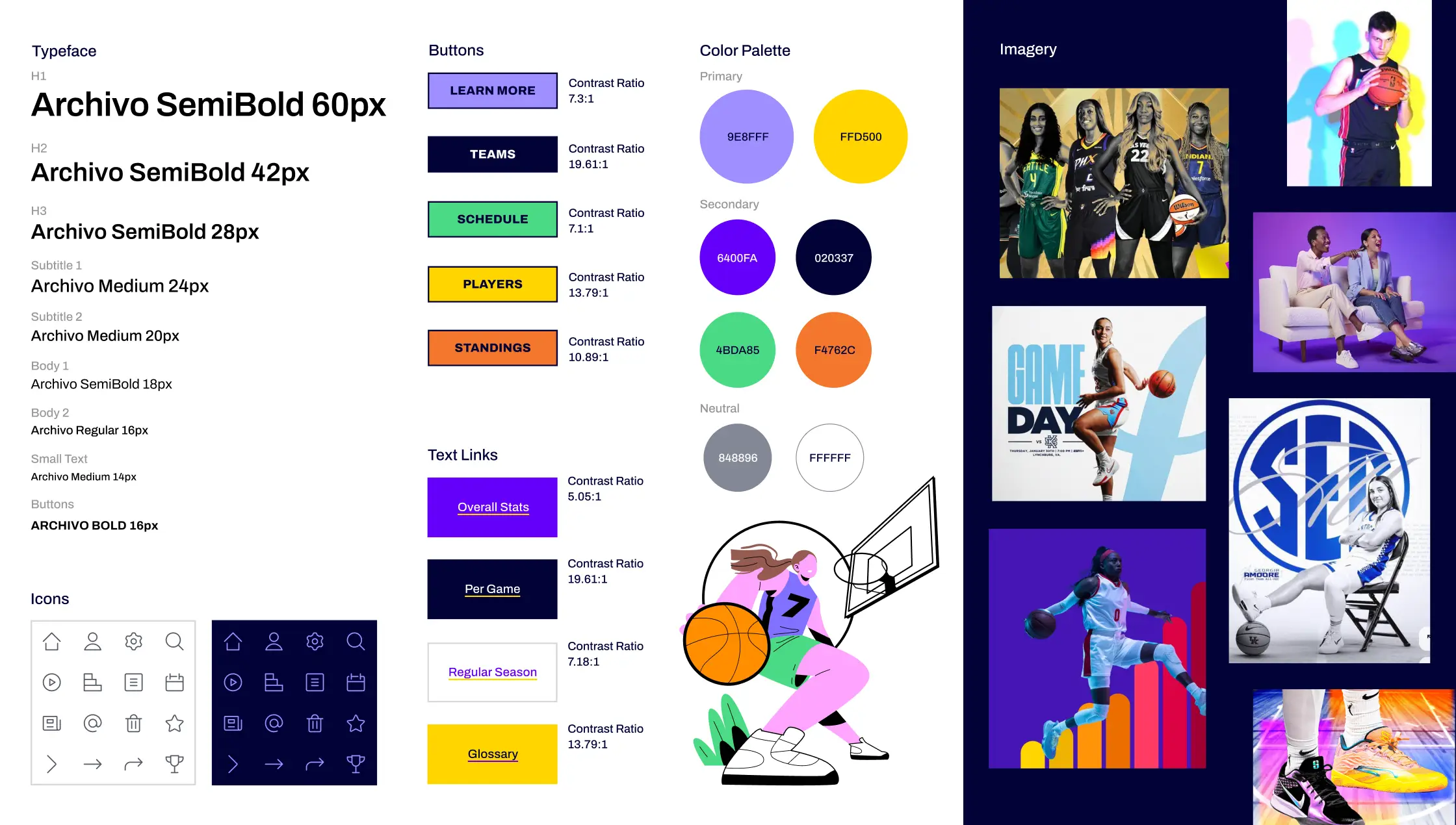
I created the Queens Court name and visual system around the idea of authority, energy and visibility.
The identity combines:
•
A crown-inspired brandmark
•
A purple and gold palette
•
Bold sports imagery
•
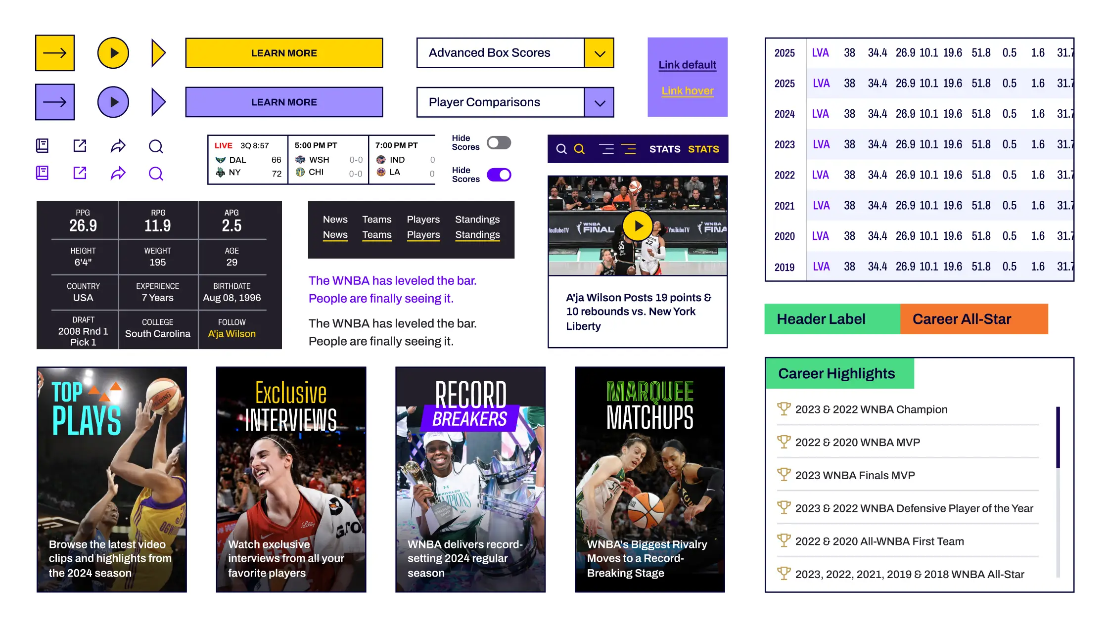
Reusable UI components
•
Typography and hierarchy designed to support both editorial content and statistical information
The goal was not simply to make the product feel feminine. I wanted the experience to feel confident, energetic and substantial enough to support the depth of the sport itself.
Logo

Style Tile
Component System
Results
5/5 participants successfully completed all 4 core tasks.
I created the Queens Court name and visual system around the idea of authority, energy and visibility.
After incorporating the low-fidelity feedback, I tested the high-fidelity experience with another 5 participants using Maze.
The study covered:
•
Home exploration
•
Player Profile
•
Player Statistics
•
Player Comparison
All 5 participants successfully completed all four tested tasks. No participant reported navigation confusion during the tested flows. Participants also responded positively to the content hierarchy and specifically called out features such as player statistics and Player Comparison as valuable parts of the experience.
Because Maze’s free plan did not provide a combined report, I manually reviewed each participant session to evaluate completion and feedback.
5 of 5
Participants successfully completed all four high-fidelity tasks
4
Core experiences tested
0
Reported navigation-confusion issues in the final tested flows
Validation
The project validated usability, not market impact.
Queens Court was an independent concept project and was not launched, so I did not have production measures such as:
•
Adoption
•
Engagement over time
•
Retention and revenue
•
Advertising performance
•
Subscription behavior
I therefore treated the testing results as evidence of usability and concept validation, not proof of product-market fit. The strongest validated outcome was the progression between rounds:
Low-Fidelity Testing
5 participants surfaced specific content and hierarchy opportunities across the core experience.
Design Iteration
I refined homepage hierarchy, player information, statistical presentation and Player Comparison based on that feedback.
High-Fidelity Testing
5/5 participants successfully completed all four core tasks with no reported navigation confusion.
This gave me confidence that the final concept was understandable and usable within the tested scenarios. It did not tell me whether fans would adopt Queens Court, return to it or change their existing sports-media habits.
Impact Math
If Queens Court launched, I would measure whether it increased depth of fan engagement, not simply whether people could navigate it.
The product hypothesis is:
Easier discovery × more opportunities for deeper player exploration × repeat fan visits = greater engagement with women’s basketball content
The leading indicators I would monitor include:
If a future business model included advertising, sponsorship, subscription or commerce, those engagement measures could then be connected to commercial outcomes. Those outcomes remain hypotheses until the product is tested in-market.
What I Learned
The hardest part of designing dense information is deciding what deserves attention.
I began Queens Court partly because I wanted to challenge myself to organize a statistics-heavy experience across responsive interfaces.
The project changed how I thought about that challenge.
The goal was not to prove that I could fit more statistics onto a screen. It was to decide which information helped fans understand the story faster and which information could be removed.
The shooting-performance visualization was a good example. It was visually interesting and technically relevant to basketball, but testing showed that simpler percentages and stronger career context were more useful within the comparison.
Removing information became as important as adding it.
What I Learned About Research
My initial assumption about “depth” was too narrow.
I assumed fans would primarily want richer athlete storytelling and historical context. The interviews showed me that different fans define depth differently. For one fan, depth meant statistics and comparison. For others, it meant control over the teams, players and social content they followed.
That changed my product thinking from:
“How do I give fans more content?”
to:
“How do I give different kinds of fans better ways to explore what matters to them?”
What I Learned About Validation
Usability validation and product validation answer different questions.
The final test gave me confidence that participants could successfully use the core experience. It did not tell me whether Queens Court would become part of their real-world sports habits.
If I were taking the concept toward development, the next question would not be:
“Can fans use this?”
It would be:
“Does this provide enough value to change how fans follow women’s basketball?”
If I Took Queens Court Further
I would validate the product direction before expanding the feature set.
My next step would be broader research with a larger and more varied group of women’s basketball fans.
The original interviews gave me useful directional insight, but 5 interviews are not enough to establish how different fan segments would behave at scale. I would then add a mid-fidelity validation round rather than moving directly from low-fidelity sketches into polished screens.
That round would focus on the biggest unresolved product questions.
1. Validate Personalization
I would prototype the dashboard direction that remained conceptual in the original project.
I would test:
•
Following teams and players
•
Choosing what appears on the dashboard
•
Controlling content hierarchy
•
Incorporating selected social content
•
How much personalization users actually want to manage themselves
2. Take Player Comparison to Mobile
Player Comparison became one of the most distinctive parts of the desktop concept, but I did not fully adapt it to mobile within the original project scope.
Before development, I would explore how two-player comparison should work within a narrow viewport without sacrificing comprehension.
3. Test Behavior, Not Just Task Completion
I would measure whether fans naturally move from discovery into deeper exploration.
That means observing:
•
What they open after a headline
•
Whether they explore player profiles
•
Whether statistics encourage further browsing
•
Whether they use Player Comparison without being prompted
•
Whether personalization creates a reason to return
4. Validate the Business Model
Only after establishing repeat fan value would I explore how the product could support a sustainable business model through areas such as partnerships, sponsorship, commerce or other revenue opportunities.
Those would need to be validated rather than assumed.
[Insert GIF of waitlist page]
[Insert screenshot of LinkedIn post]
[Insert screenshot of LinkedIn post]
Final Reflection
Queens Court started as a question I had as a fan:
If women’s basketball is growing this quickly, why does following it still require so much searching?
If women’s basketball is growing this quickly, why does following it still require so much searching?
Research showed me that the answer was more nuanced than simply putting more coverage in one place.
Fans wanted different kinds of depth.
Some wanted stories.
Some wanted statistics.
Some wanted more control over the players and teams they followed.
That changed the product from a content destination into a broader exploration of how discovery, depth and personalization could work together.
The most important lesson was that supporting fandom does not mean showing people everything. It means giving them better ways to find, understand and follow what they already care about.
Final Prototype
See Queens Court in motion.
If women’s basketball is growing this quickly, why does following it still require so much searching?
If women’s basketball is growing this quickly, why does following it still require so much searching?
Research showed me that the answer was more nuanced than simply putting more coverage in one place.
Fans wanted different kinds of depth.
Some wanted stories.
Some wanted statistics.
Some wanted more control over the players and teams they followed.
That changed the product from a content destination into a broader exploration of how discovery, depth and personalization could work together.
The most important lesson was that supporting fandom does not mean showing people everything. It means giving them better ways to find, understand and follow what they already care about.