
Apple TV Hub
Accessing streaming content is easy, keeping it organized isn’t.
Streaming organization concept for tvOS
Streaming content is easy to access, but much harder to keep track of across platforms. Watch history is fragmented, recommendations are easily forgotten and favorite shows can disappear between seasons. Apple TV Hub brings everything into one place so users can save, organize and revisit content across subscriptions.
Role
Product Designer
Project Type
Solo concept project
Responsibilities
Research, information architecture, interaction design, prototyping, usability testing
Platform
tvOS concept for Apple TV
Tools
Figma, FigJam, Maze, Miro, Adobe Creative Suite
Timeline
4 weeks
Research Insights
The problem with today’s streaming experience.
Research uncovered three recurring issues: fragmented content, unreliable watch-history behavior and the mental burden of remembering where shows live across platforms.
What I heard from viewers
Participants consistently described three frustrations: navigating multiple streaming services, unreliable continue-watching features and feeling overwhelmed by the sheer amount of content available.
“The ‘continue watching’ feature doesn’t always remember where I left off, so I end up searching for it again.”
Key research themes
These patterns revealed an opportunity to help users navigate multiple apps, rediscover content more easily and spend less time relying on memory or repeated searches.
Fragmented viewing
Content is spread across multiple streaming apps, each with different UI patterns, making it difficult for users to build consistent viewing habits across platforms.
Memory burden
Watch history and continue-watching features are not always reliable, forcing users to remember what they watched and where to find it.
Decision fatigue
An abundance of choices paired with generic recommendations leads to wasted time searching and in many cases, abandoning browsing altogether.
Design Strategy
Finding something to watch shouldn’t require five apps and a memory test.
These insights shaped how Apple TV Hub was structured, prioritized and designed. Each one connects a user need to a specific product decision.
Representative user

How might we help users organize, rediscover and enjoy streaming content across multiple services without relying on memory or repeated searches?
Solution Development
How research patterns became design decisions.
Key focus areas
These focus areas were shaped by recurring research patterns and guided the design of Apple TV Hub. Each one addresses a key user need around organizing, discovering and revisiting content across streaming services.
Centralized content hub
Position Apple TV Hub as one place to manage, organize and revisit content across subscribed services.
Flexible personalization
Give users more control over how content is organized and prioritized based on their viewing habits.
Smarter discovery
Improve discovery through more relevant recommendations and conversational search tailored to users’ subscriptions and preferences.
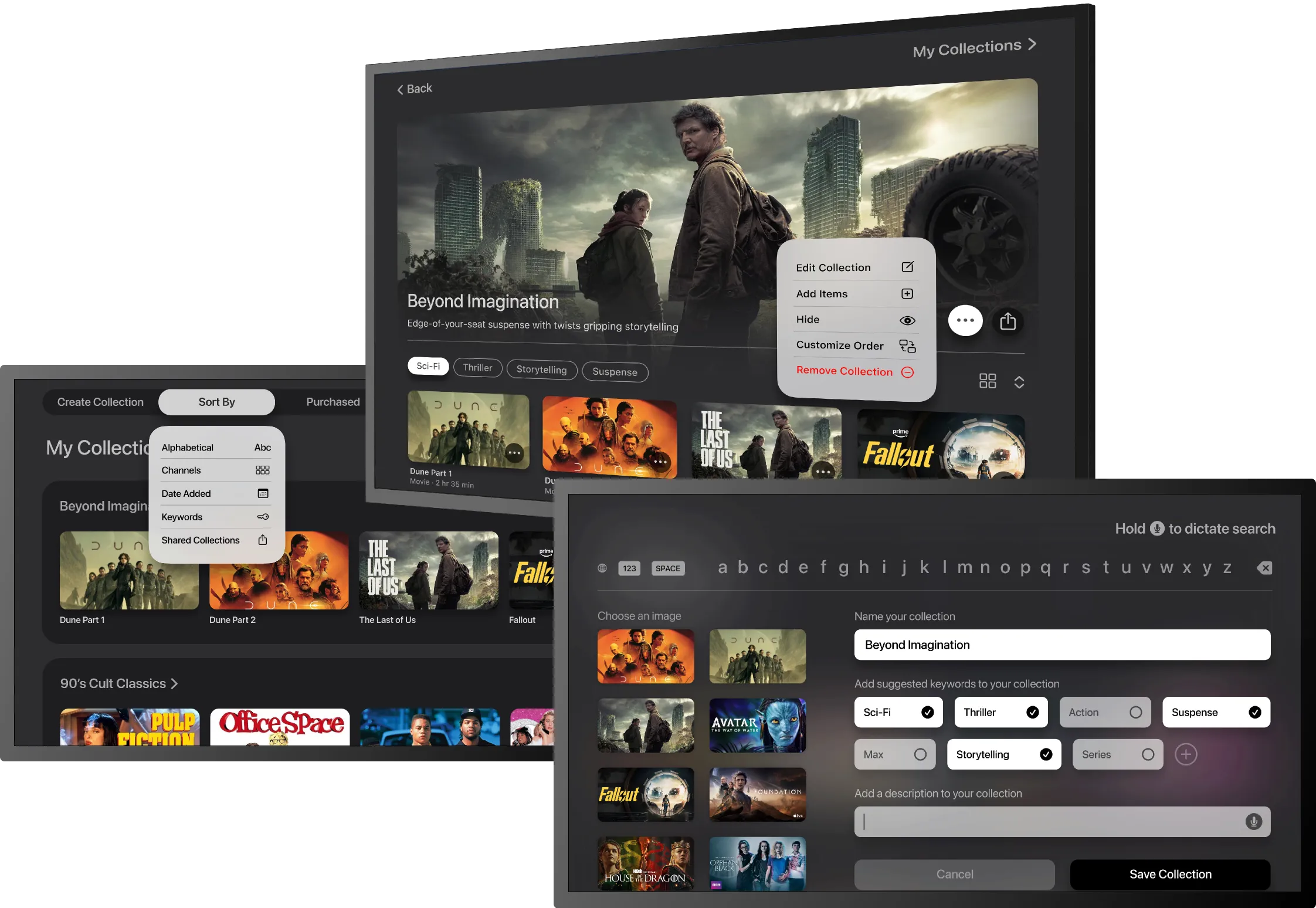
Save collections
Let users create and organize collections of favorite content to revisit or share later.
User flows
I designed three core user flows to explore how these focus areas could work together in a cohesive Apple TV Hub experience. Each flow addresses a recurring user need identified in research.
Collection creation
Conversational search
Notification setup
Collection creation
This primary flow addresses a common frustration: forgetting where content lives and what has already been watched. It shows how users can save favorite titles into collections, making it easier to organize content across services and return to it later.

Wireframes
Need copy here.
Home Page
Player Bio
Home Page
Low-fidelity wireframes were used to validate layout, navigation, and hierarchy before moving into high-fidelity design. These wireframes helped confirm that core actions—saving content, searching, and resuming playback—felt intuitive and accessible within the Apple TV experience.