Apple TV Hub

Accessing streaming content is easy, keeping it organized isn’t.
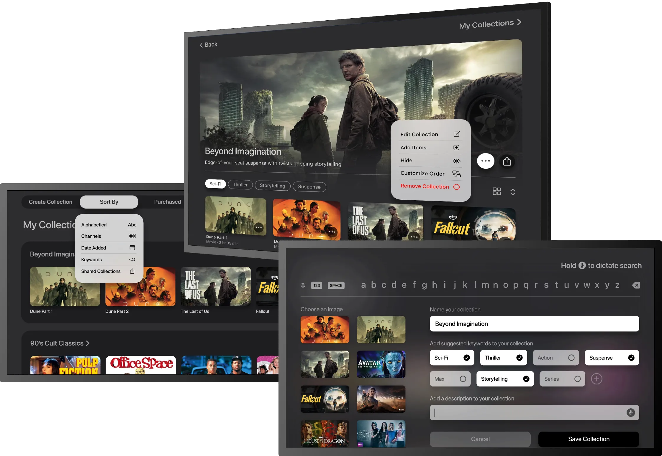
Streaming organization concept for tvOS

Streaming content is easy to access, but much harder to keep track of across platforms. Watch history is fragmented, recommendations are easily forgotten and favorite shows can disappear between seasons. Apple TV Hub brings everything into one place so users can save, organize and revisit content across subscriptions.

Role

Product Designer

Project Type

Solo concept project

Responsibilities

Research, information architecture, interaction design, prototyping, usability testing

Platform

tvOS concept for Apple TV

Tools

Figma, FigJam, Maze, Miro, Adobe Creative Suite

Timeline

4 weeks

Research Insights

The problem with today’s streaming experience.

Research uncovered three recurring issues: fragmented content, unreliable watch-history behavior and the mental burden of remembering where shows live across platforms.

Access

Users subscribe to multiple streaming services

They’re overloaded with content options across these platforms

Navigating each apps UI patterns requires memory

Friction

Watch history features are often unreliable

Hard to remember where content lives when revisiting

Suggested content recommendations are generic and biased towards proprietary content

Result

Frustrating and inconsistent UI experiences

Users waste time searching for content

They often abandon browsing altogether

Unfulfilled spending money on several apps

Opportunity

One centralized platform allowing flexibility to organize streaming content across apps

Personalized and unbiased content recommendations

Content suggestions only from users’ subscribed services

Access

Users subscribe to multiple streaming services

Overloaded with content options across platforms

Managing subscriptions requires effort and memory

Friction

Different UI patterns across platforms

Watch history features are often unreliable

Hard to remember where content lives when revisiting

Content recommendations feel generic or biased

Result

Frustrating and inconsistent UI experiences

Users waste time searching for content

They often abandon browsing altogether

Opportunity

One place to organize streaming content

Personalized recommendations

Content surfaced only from subscribed services

What I heard from viewers

Participants consistently described three frustrations: navigating multiple streaming services, unreliable continue-watching features and feeling overwhelmed by the sheer amount of content available.

“The ‘continue watching’ feature doesn’t always remember where I left off, so I end up searching for it again.”

Interrupted Viewer

Female, 26

“Browsing takes way too long. There are so many options that I end up spending more time searching than actually watching.”

Indecisive Streamer

Male, 59

“Sometimes I forget where I was watching something and end up opening every app just to rediscover it.”

App Hopper

Female, 48

Key research themes

These patterns revealed an opportunity to help users navigate multiple apps, rediscover content more easily and spend less time relying on memory or repeated searches.

Fragmented viewing

Content is spread across multiple streaming apps, each with different UI patterns, making it difficult for users to build consistent viewing habits across platforms.

Memory burden

Watch history and continue-watching features are not always reliable, forcing users to remember what they watched and where to find it.

Decision fatigue

An abundance of choices paired with generic recommendations leads to wasted time searching and in many cases, abandoning browsing altogether.

Design Strategy

Finding something to watch shouldn’t require five apps and a memory test.

These insights shaped how Apple TV Hub was structured, prioritized and designed. Each one connects a user need to a specific product decision.

Restore Continuity

Problem: Users struggle to return to content when watch history, favorites and saved items are scattered across platforms.

Decision: Create one centralized hub where users can save, organize and revisit content across subscribed services.

Improve Discovery

Problem: Generic, platform-driven recommendations make it harder for users to find content that matches their preferences.

Decision: Prioritize personalized recommendations using content from services users already subscribe to.

Create Familiar Navigation

Problem: Navigating different interfaces across apps adds unnecessary friction to what should be a pleasant experience.

Decision: Design a consistent, familiar interactive platform that reduces learning curves and supports effortless browsing.

Representative user

Lena represents viewers who regularly stream across multiple platforms and value organization, efficiency and personalized recommendations.

I created the following persona to represent a core audience segment identified through research. Jordyn reflects fans who are deeply invested in women’s basketball but feel underserved by existing sports media platforms.

Lena Lang

Age:

43

Occupation:

Marketing Coordinator

Location:

Chicago, IL

Streaming Habits:

4–8 hours/week across multiple subscriptions

Overview

Lena streams content across several platforms and subscriptions. With a busy schedule and long breaks between shows, she often forgets what she watched and where content lives. She wants a simpler way to track, organize and rediscover content without wasting time searching.

Frustrations

Forgetting where a show or movie lives

Unreliable watch history across apps

Generic, repetitive recommendations

Spending more time browsing than watching

Goals

Keep track of watched and saved content across subscriptions

Rediscover shows quickly after time away

Get recommendations that match her preferences

Spend less time searching and more time watching

Lena Lang

Age:

43

Occupation:

Marketing Coordinator

Location:

Chicago, IL

Streaming Habits:

4–8 hours/week across multiple subscriptions

Overview

Lena enjoys streaming a wide range of shows and movies across several platforms. With a busy schedule and many streaming subscriptions, she often struggles to remember what she’s watched and where content lives – especially when returning to shows after long breaks. She wants a simpler way to track, organize and rediscover content without wasting time searching.

Frustrations

Forgetting which platform hosts a specific show or movie

Inconsistent or unreliable watch history across apps

Repetitive, impersonal recommendations

Spending too much time browsing instead of watching

Goals

Keep track of watched and saved content across all subscriptions

Quickly rediscover shows after time away

Receive recommendations that match her preferences

Spend less time searching and more time enjoying content

How might we help users organize, rediscover and enjoy streaming content across multiple services without relying on memory or repeated searches?

Solution Development

How research patterns became design decisions.

Key focus areas

These focus areas were shaped by recurring research patterns and guided the design of Apple TV Hub. Each one addresses a key user need around organizing, discovering and revisiting content across streaming services.

Centralized content hub

Position Apple TV Hub as one place to manage, organize and revisit content across subscribed services.

Flexible personalization

Give users more control over how content is organized and prioritized based on their viewing habits.

Smarter discovery

Improve discovery through more relevant recommendations and conversational search tailored to users’ subscriptions and preferences.

Save collections

Let users create and organize collections of favorite content to revisit or share later.

User flows

I designed three core user flows to explore how these focus areas could work together in a cohesive Apple TV Hub experience. Each flow addresses a recurring user need identified in research.

Collection creation

Conversational search

Notification setup

Collection creation

This primary flow addresses a common frustration: forgetting where content lives and what has already been watched. It shows how users can save favorite titles into collections, making it easier to organize content across services and return to it later.

Collection creation

Conversational search

Notification setup

Collection creation

This primary flow addresses a common frustration: forgetting where content lives and what has already been watched. It shows how users can save favorite titles into collections, making it easier to organize content across services and return to it later.

Wireframing the experience

Early low-fidelity explorations helped define navigation, sharing and content organization before moving into high-fidelity design.

Sharing & Sorting

Navigation & Search

Sharing & Sorting

Mapped how users could share collections, confirm collaborators and reorganize content.

Test & Iterate

Helpful insights that elevated the user experience.

Test & Iterate

Helpful insights that elevated the user experience.

I conducted usability testing with 3 participants using low-fidelity prototypes for collection creation, sharing and conversational search. Our sessions focused on navigation clarity, content organization and validating key actions.

Test 1

Hub Landing

Hub Landing Screen

I evaluated how easily users could navigate the Hub landing screen, understand its content hierarchy and identify key actions.

Before

Participants understood the value of a centralized hub, but some core actions were unclear. They looked for a quick search function and found the Recently Watched utility buttons ambiguous.

After

A visible search icon was added and the utility buttons were given action labels. Content hierarchy was adjusted with more clearly defined rows.

Design Outcome

These updates improved discoverability and made the landing screen feel more intuitive as a cross-platform streaming hub. Replacing ambiguous controls with recognizable actions helped users better understand what they could do next.,

Test 2
Test 2

Create Collection

Create Collection

Evaluated navigation clarity and the usability of creating and managing collections.

1. Collection Setup

2. Collection Details

Before

Participants found the inputs for category, genre and keywords confusing, making the form feel more complex than necessary.

After

Reorganizing inputs and adding ‘hold to dictate’, aligned more closely to tvOS. The Tag+ function was retained to support AI-assisted content discoverability.

Design Outcome

The revised layout made the inputs more intuitive to tvOS and cross-platform apps. This improved the usability of creating a collection.

1. Collection Setup

Before

Participants found the inputs for category, genre and keywords confusing, making the form feel more complex than necessary.

After

Reorganizing inputs and adding ‘hold to dictate’, aligned more closely to tvOS. The Tag+ function was retained to support AI-assisted content discoverability.

Design Outcome

The revised layout made the inputs more intuitive to tvOS and cross-platform apps. This improved the usability of creating a collection.

Before

Participants expressed the option to customize their page view and title-level options like ‘Play Now’, ‘Go to Series’ and availability status.

After

Clear title-level actions were introduced along with status cues and additional metadata information.

Design Outcome

The user experience was improved by adding action labels, availability cues and important metadata to the title thumbnails. This gives them granular control of their collections.

2. Collection Details

1. Collection Setup

2. Collection Details

Before

Participants found the inputs for category, genre and keywords confusing, making the form feel more complex than necessary.

After

Reorganizing inputs and adding ‘hold to dictate’, aligned more closely to tvOS. The Tag+ function was retained to support AI-assisted content discoverability.

Design Outcome

The revised layout made the inputs more intuitive to tvOS and cross-platform apps. This improved the usability of creating a collection.

Test 3

Share Collection

I evaluated how clearly users share collections, understand sharing status and manage shared content within a tvOS-style interface.

Before

Participants wanted more flexible sharing options, clearer ownership indicators and better control over shared collection settings.

After

I added multiple sharing methods, introduced clearer shared-state indicators and replaced the top icon menu with a tvOS-style tab bar.

Share Collection high-fidelity
Share Collection low-fidelity wireframe
Design Outcome

These updates made sharing feel more collaborative and intuitive by improving control, clarifying ownership and aligning the experience more closely with tvOS navigation patterns.

Final Concept

See the final concept in motion.

View the Figma prototype

Final outcome

Apple TV Hub is a concept to make streaming content easier to organize, revisit and discover across multiple subscriptions. The final experience brings watch history, saved content, collections and personalized recommendations into one centralized hub, helping users spend less time searching and more time watching.

Why it matters

Today’s streaming experience gives users a plethora of content, but not a clear way to manage it. Apple TV Hub addresses that gap by creating a more intuitive cross-platform viewing experience. Features like creating/sharing collections and conversational search help users return to what they care about without relying on repeated searches or fragmented app navigation.

Next steps

Given more time, I would test how users customize hub sections, validate how shared collections influence discovery and refine how conversational search surfaces results across subscribed and unsubscribed services. I would also explore stronger personalization features to make the experience feel even more adaptive to each viewer’s habits over time.

Let’s connect to collaborate.

Let’s connect to collaborate.

Let’s connect to collaborate.

Designed in L.A. 🌴 with love 🤟

© 2026 Work with Gina

Designed in L.A. 🌴 with love 🤟

© 2026 Work with Gina

Designed in L.A. 🌴 with love 🤟

© 2026 Work with Gina